This is: Client work
Nimbus.
I was commissioned by Nimbus to completely overhaul their brand and visual identity and make them truly stand out in a crowded Software-as-a-Service (SaaS) marketplace.
Nimbus had an identity crisis.
The software was good (site data and documentation for property developers), but the brand was a mish-mash of ideas and styles lacking any kind of consistency, and the weakest point in all of this was the logo.
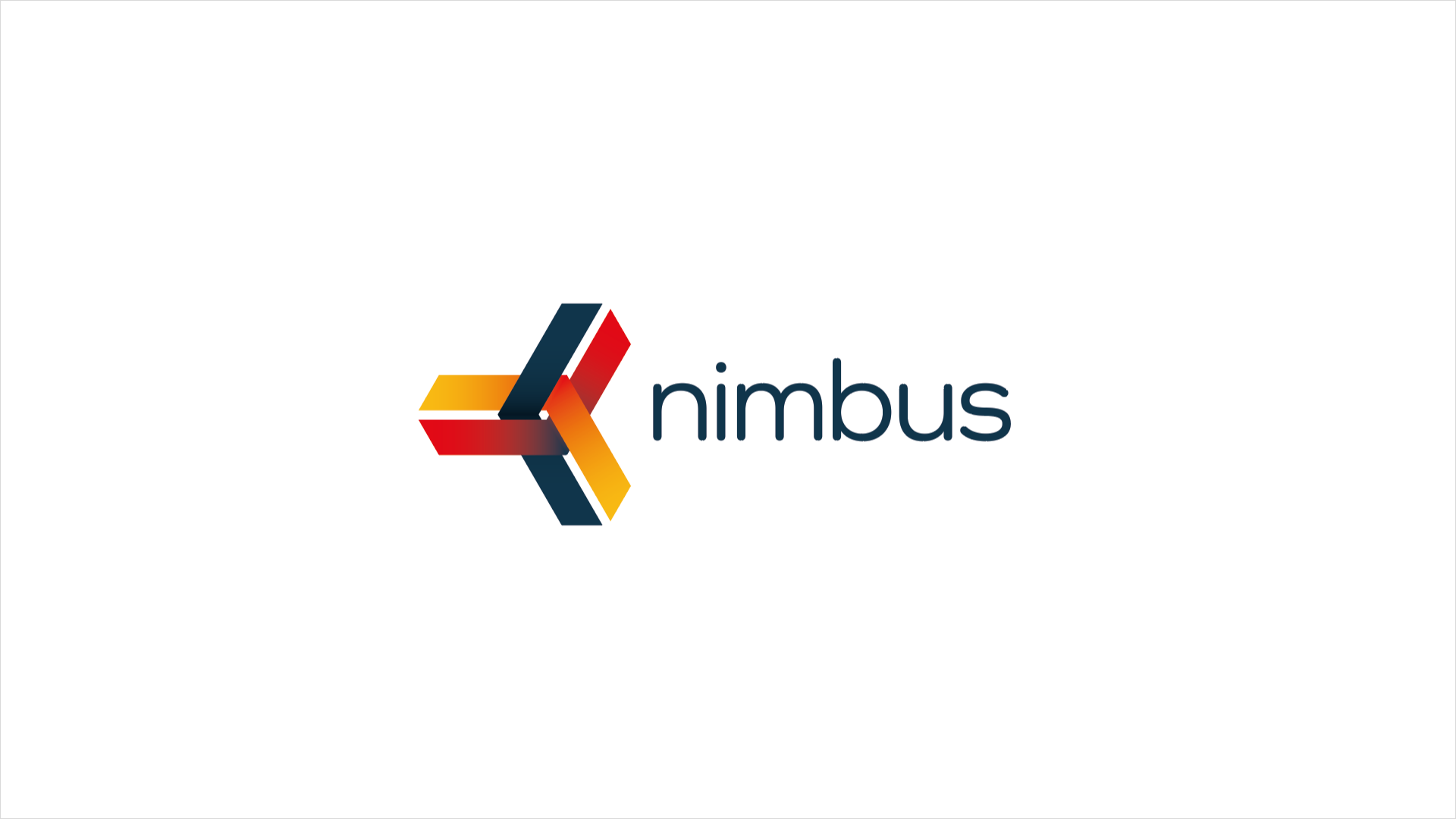
It just didn't say anything about what they did. It had a cloud, and Nimbus is a type of cloud, but this wasn't cloud software. It made a feature of the N, but there was no real reason why it did this.
It was time for someone to help Nimbus figure out who they were in this great big SaaS landscape.
And to help them stand out without using teal or purple.
Because everyone used teal and purple.
Working closely with Helen Lawton, the Head of Marketing, who I had collaborated with previously at Myzone, we quickly began to workshop some fully formed concepts. These were designed with the SaaSs marketplace in mind - bold and colourful - and as complete as possible so that we could present and iterate quickly.
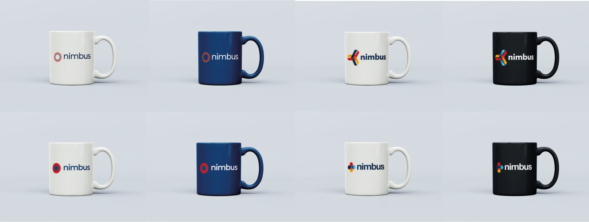
The colourscheme for these initial concepts was refined to 4 distinct, strong colours: yellow, cyan, red and navy. Not every concept used all 4, but in combination, and with subtle use of gradients, there was a real sense of movement and they were definitely a step up from what Nimbus had at the time. That said, even though they looked great on a mug, they weren't the one.
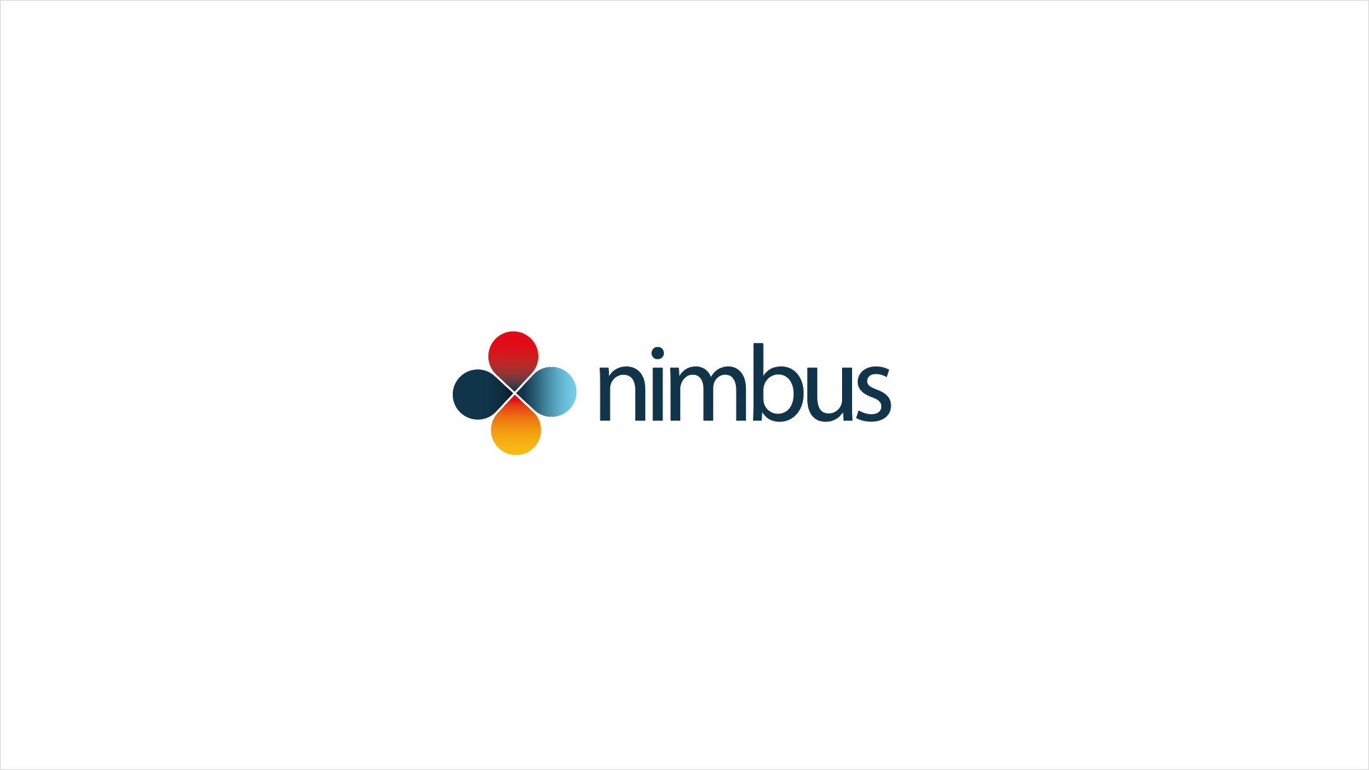
But we liked the circles.
So, we looked at the circles.
Nimbus doesn't just mean cloud - it can also refer to the circle of light around the heads of subjects in religious imagery.
We liked that more than clouds.
And something clicked. But even so, it still wasn't there.
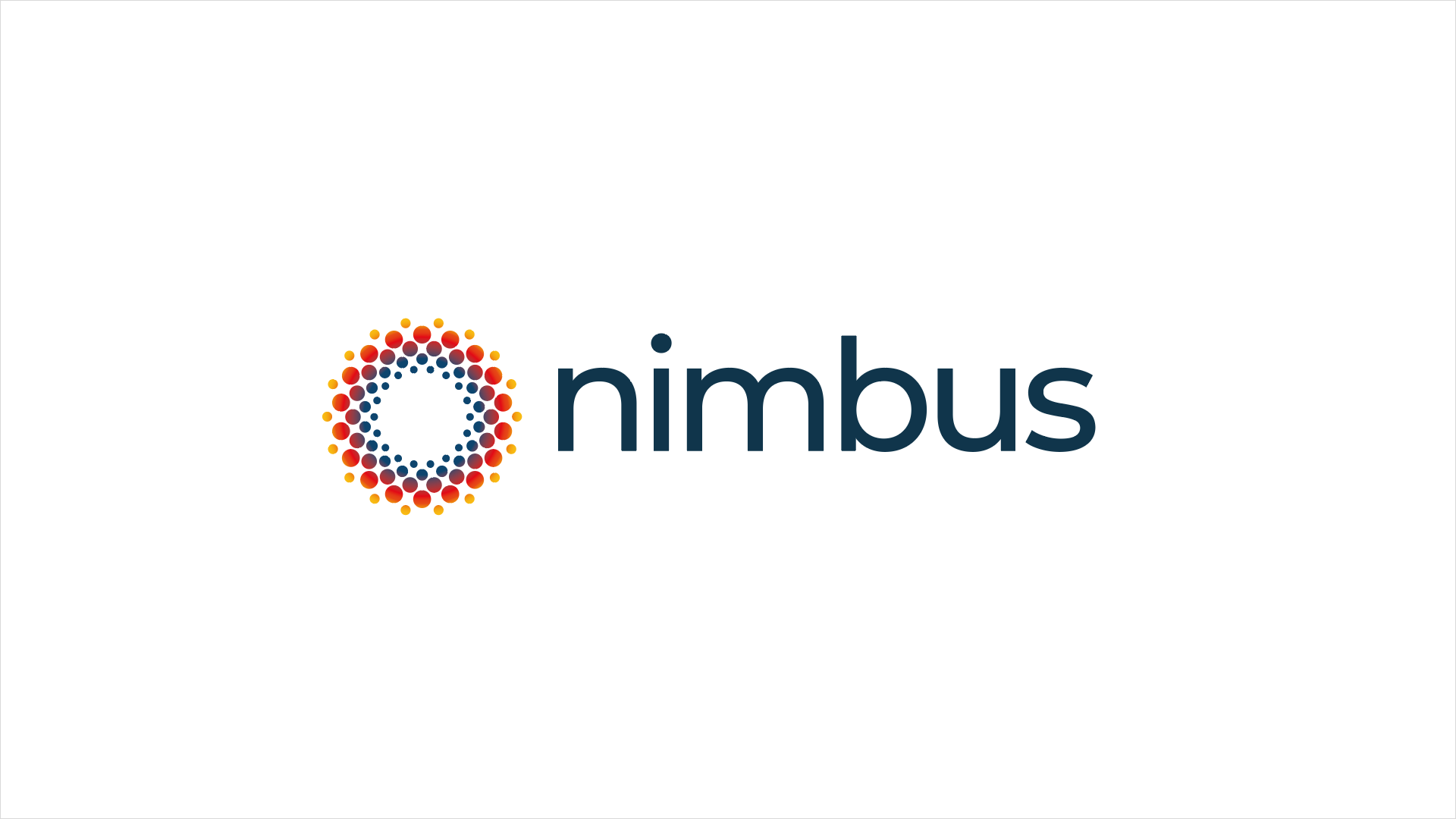
The stepped gradient created a real tunnel effect, which we liked as an allegory for how you can get lost down the data rabbit hole once you get stuck in to the layers and layers of data Nimbus returns.
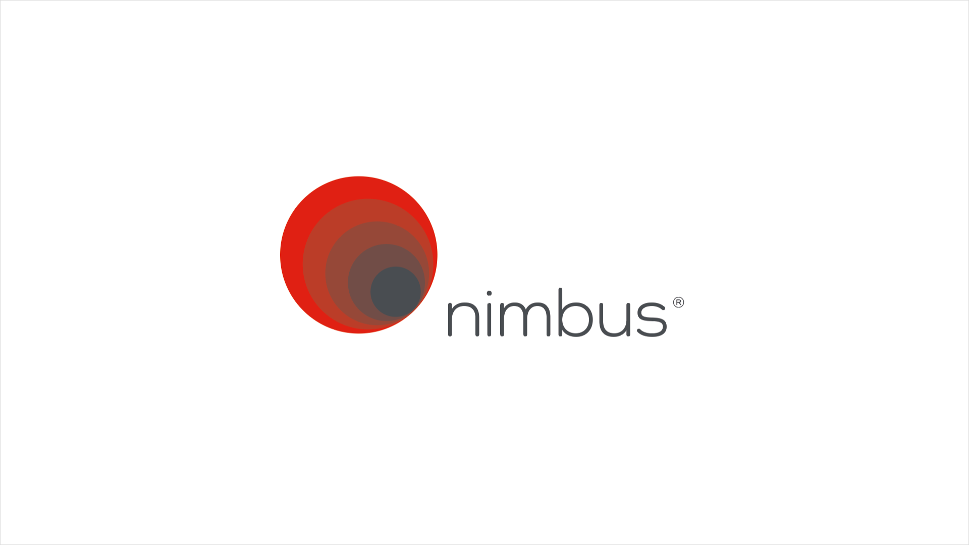
The off-centre concentric circles created an imbalance, and stopped the logo being as versatile. Similarly the text was a little too soft around the edges. Property is a hugely competitive market, and so we pulled it back here, pushed it out there and searched long and hard for a type treatment that would carry the brand on its shoulders. And we found it. We then centred the circles, and began to rebalance the elements.
The only issue we still faced was colours. They were too washed out and it still wasn't selling Nimbus as a dynamic, future-proof brand. We moved away from the almost black to an inky indigo and this caused the red to absolutely pop and the rabbit hole aspect to get even deeper.
This was the one.
But just before launch, a competitor released a brand update of their own out of the blue, and they had chosen almost the same inky indigo. I mean, if you put one on top of the other they were almost indistinguishable.
So we pivoted.
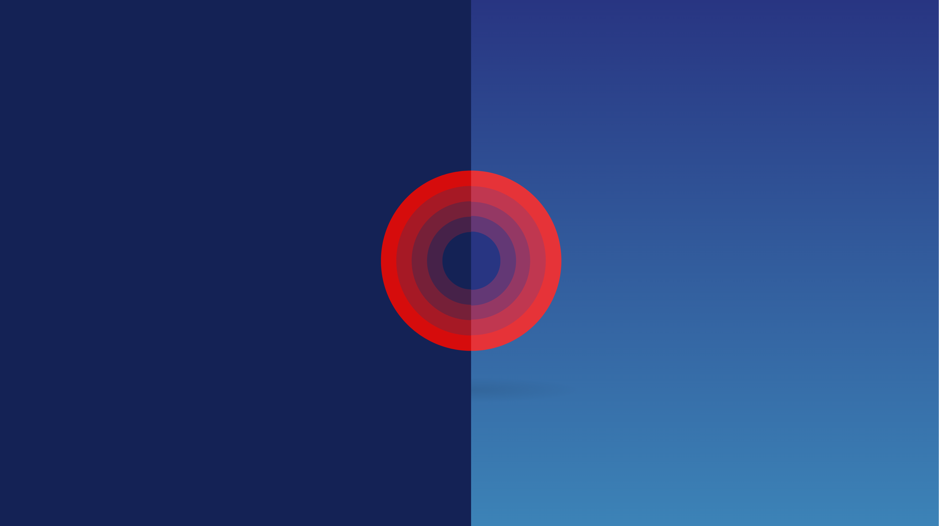
We updated the blue again to be a shade lighter, and introduced a gradient for the background, and the logo just began to sing.
This felt right.
And now we could have some fun with it.
Introducing, Nimbopoly.
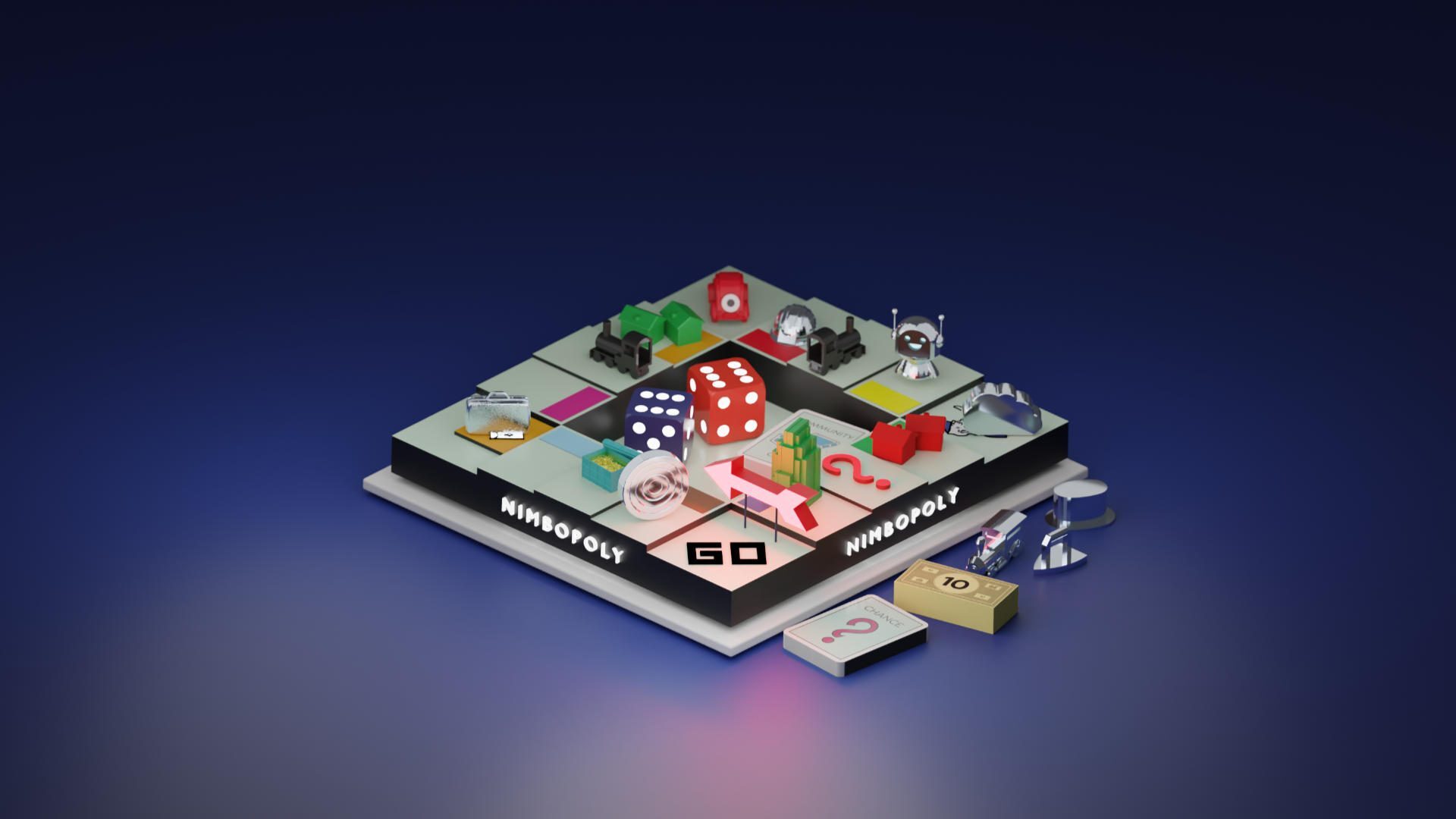
This was a lot of fun to produce. I really got to up my Blender and general 3D skills for this little exercise, and it was very well recieved on the socials when we went live.
Player tokens include the new Nimbus roundel, the old cloud, the robot we affectionately nicknamed "Nimbie" (Internally, at least - IYKYK), a construction hard hat...
There's a whole chest of gold coins on the community chest square. Every detail!
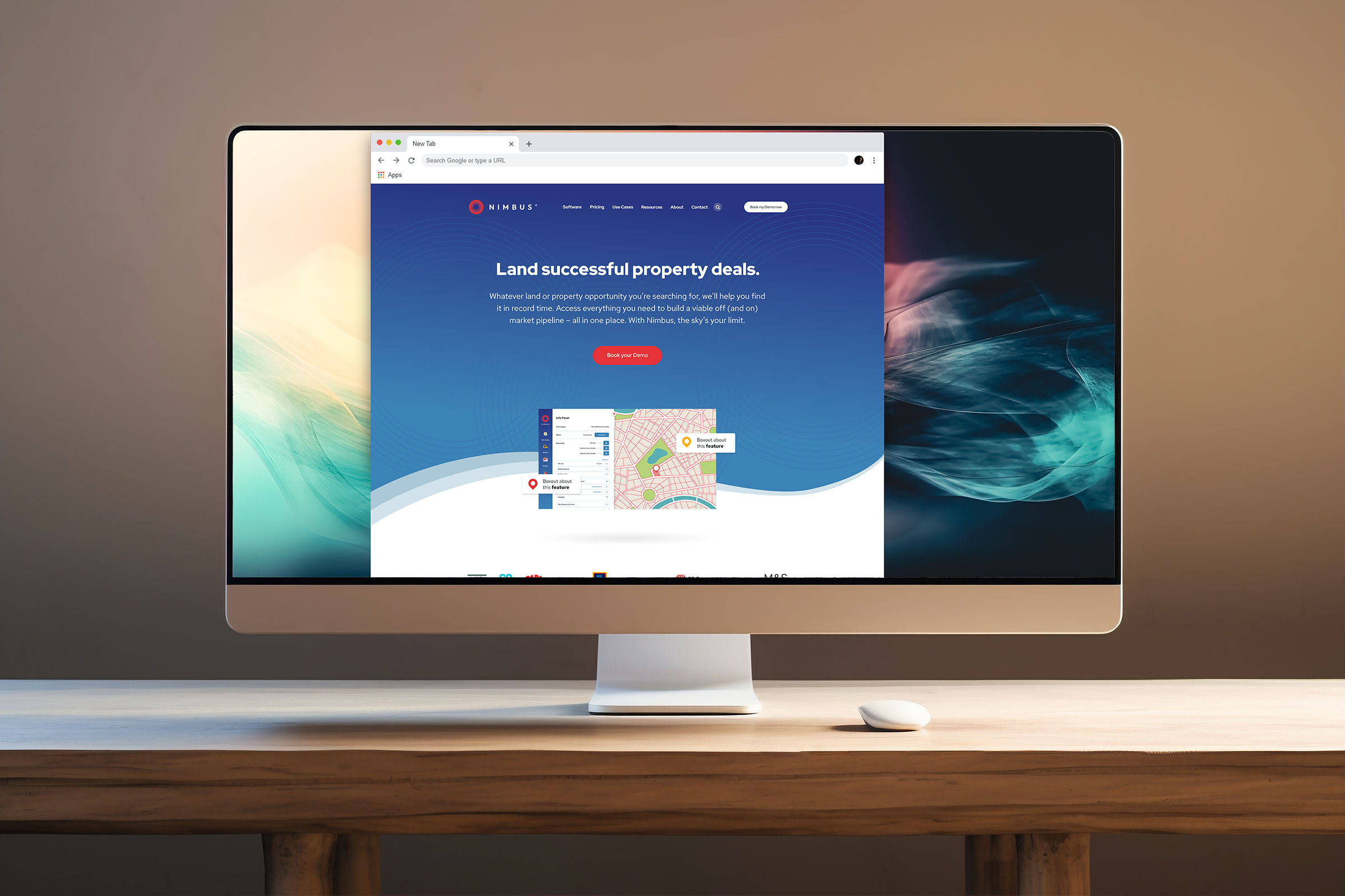
Oh yeah, I almost forgot - there was a new website as well.
This was far more than just a logo. It was a whole design system.
There's more to this old designer's tale, and I will add it very soon.
Chris is one of the most competent creatives I have met. Working at pace to update brand guidelines, launch a new product and website simultaneously. Chris was an extension to our inhouse team supporting us to achieve the impossible - delivering everything that was needed in record time. It's rare to find strategic thinking designers that also have the ability to create awesome designs. Chris' attention to detail is off the chart, allowing him to make even the simplest designs look beautiful.
